Our Sign Design Tips
Do you know these top Design Tips?
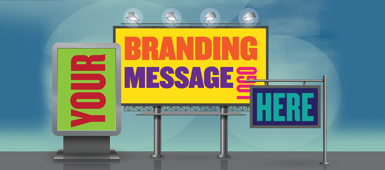
Those of us in the signage industry know what makes a good sign; the design, the application, and the right products. But sometimes your clients might struggle to appreciate this. So we’ve put together 9 must-know sign design tips for you to share with them.
1. How good sign design attracts customers
When it comes to branding, advertising and getting attention good sign design is possibly hardest working, yet most cost-effective marketing a business can do. Think about it. Once it’s paid for, you’re done. A sign works 24/7. It doesn’t take breaks, it’s not in the newspaper for a day, or on air for 30 seconds, and then gone. It’s out there slogging its guts out, day and night.
In fact, more than half of small business-owners find good sign design and graphics are effective in attracting customers. The way a sign is designed can have a huge influence on a company’s ability to attract new customers, so here are nine key Sign Design Tips that will get businesses better results.
2. What is your sign’s primary objective?
Let’s start with something so obvious, many businesses overlook. With sign design, you need to determine what does the sign have to do? Signal to passing motorists where your business is? Get them to call you? Obey an instruction? Choose your brand when they are out shopping?
NOTE: For businesses, a secondary objective is often raising brand awareness by including branding and logo.
3. Who is your Sign Design Target Audience?
Here’s a handy starting point: Is your message aimed at potential customers, existing clients, employees, visitors, students, members, residents, patients, guests, suppliers, shoppers or passing motorists?
4. Location, location, location
Think of your sign design in terms of primary placement. Is it indoors or outdoors? On the ground? Above a business? Is it against the sky, like a billboard? On a moving vehicle? Consider the background colour of this location, as this will help you select a colour palette that contrasts with this environment.
5. Size and Scale
It’s important to think of your sign design in terms of size and scale. Signs have to be read at a distance and understood in just a few seconds. The larger the letter (within reason), the easier it is to read. Everything should be big and simple for maximum impact.
6. What should your sign say?
Words are one of the most important design elements in signage. Yet people often don’t think of words in this way – which is why we often see such bad writing. Successful signs communicate clearly and concisely. Choose words that match the sign’s objective. When writing a headline, keep it simple – fifteen words or less is best. One industry formula is referred to as the 3 by 5 rule. It is set down in two ways:
- Three lines of text, up to five words each
- Five lines of text, up to three words each
If the words are long, decrease those counts.
7. Sign Colour
Colour is incredibly important in sign design. Studies have shown 80% of trademark recognition is due to its colour (think ‘Coke red’). Colours should be bright and saturated. Avoid pastels and light colours. And be wary of trendy colours. What’s ‘cool’ today may be ‘yuk’ tomorrow.
8. Contrast and readability
Most signs feature text or graphics in the foreground, with a continuous background colour. The contrast between these two elements will determine a sign’s readability and a reader’s comprehension of the message. Consider dark text on a light background or light on dark. Pairing similar colours decreases readability – if the contrast is weak, strengthen it with an outline or drop shadow on the foreground lettering.
9. Use simple Typography
Keep type simple. Apart from your logo, pick a single font. Consider what fonts are easy to read at a distance.
San serif with uniform and medium to wide stroke widths are effective in communicating quick bursts of information (e.g. Helvetica, Century Gothic, Veranda).
Serif fonts project a more sophisticated image and make larger blocks of text easier to read – but not when in all-CAPS (e.g. Times New Roman, Garamond, Palatino). Finally, avoid fancy cursive fonts, as these are hard to read at a glance.
Why materials matter
Not all materials are created equal. Just because it’s the most expensive doesn’t mean it’s the best material for the job. That’s why it’s important to use your preferred supplier, who has the backing of their team and support through CL Group, who has New Zealand’s widest range of self-adhesive films, especially for signs.
Conclusion
Good sign design is simple, with high contrast, easy to read, visible and readable from a distance, and does its job in just a few seconds.